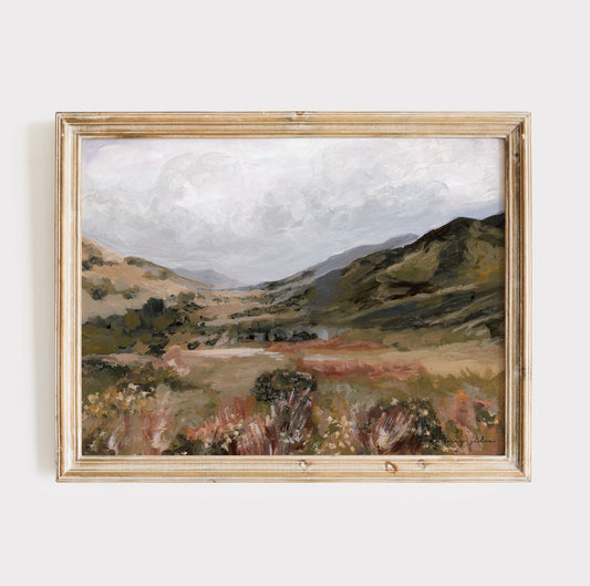
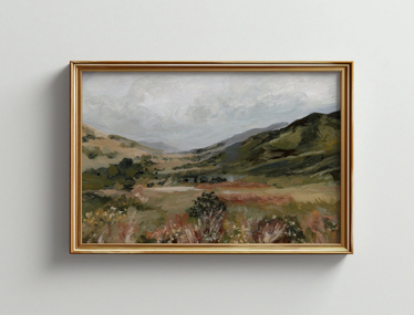
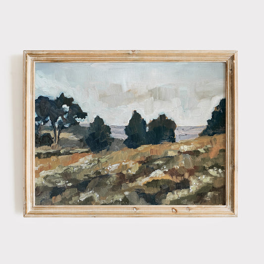
There’s something timeless and calming about the colors of the coast. Soft sand, seafoam green, hazy blue skies, and driftwood neutrals. These natural hues don’t just belong on the beach, they belong in our homes, our creative work, and even our daily lives.
As a coastal artist living and painting in Florida, I’ve come to treasure the emotional power of these tones. Whether I’m standing in front of a blank canvas or decorating a quiet corner of our home, I find that coastal colors bring a deep sense of stillness, light, and warmth.
What Is a Coastal Palette, Really?
True coastal palettes are subtle and elegant, not loud or overly themed.
Think:
-
Sage green
-
Sand beige and ivory
-
Stormy blue and dusty sky
-
Dune camel grass
-
Driftwood gray and soft taupe
-
Muted pink and soft coral
These colors reflect the rhythm of the ocean and the calm of open space. I feel that they are soothing, restorative, and timeless.
Using Coastal Palettes in Art
Layering for Depth - In oil painting, I build coastal tones slowly. Gentle layers of beige, sage, or blue add softness and light, creating a piece that feels alive and peaceful.
Letting Nature Lead - I let natural forms such as dunes, waves, skies, inspire my shapes and compositions. These colors follow the landscape’s curves and contours beautifully.
Choosing Intention Over Trend - Instead of chasing color trends, I choose tones that reflect what I want the viewer to feel like the feeling of calmness, being connected, and at peace.
How to Add Coastal Palettes into your Home
Start with Warm Neutral Colors - Paint walls in sandy white, soft taupe, or foggy gray to set a quiet foundation for your mood in your home.
Use Artwork to Add Emotion to Your Space - Choose paintings or prints with coastal palettes to add visual calm. Soft seascapes or abstract horizon lines create focal points without overwhelming a room.
Incorporate Natural Materials into Your Space - Pair your colors with linen, rattan, driftwood, and other earthy textures to enhance that grounded, coastal look.
Layer in Your Accent Colors Gently - Use muted blues, sage greens, or blush pinks in pillows, ceramics, or rugs for pops of color that stay within the calm, cohesive palette.
Why These Colors Matter
For me, these colors do more than just “look pretty.” They remind me of God's presence in creation. They bring stillness into busy homes, clarity into creative blocks, and warmth into quiet corners. When I create or decorate with these tones, I’m not just choosing a palette, I see it as choosing peace and calmness.
In conclusion, you don’t have to live near the beach to live with its calmness.🌊 By surrounding yourself with coastal tones whether in art, design, or daily life, you’re inviting in more light, more rest, and more beauty.
🤍Whitney